Color Dynamics in Banner Advertising for Online Card and Wheel Promotions
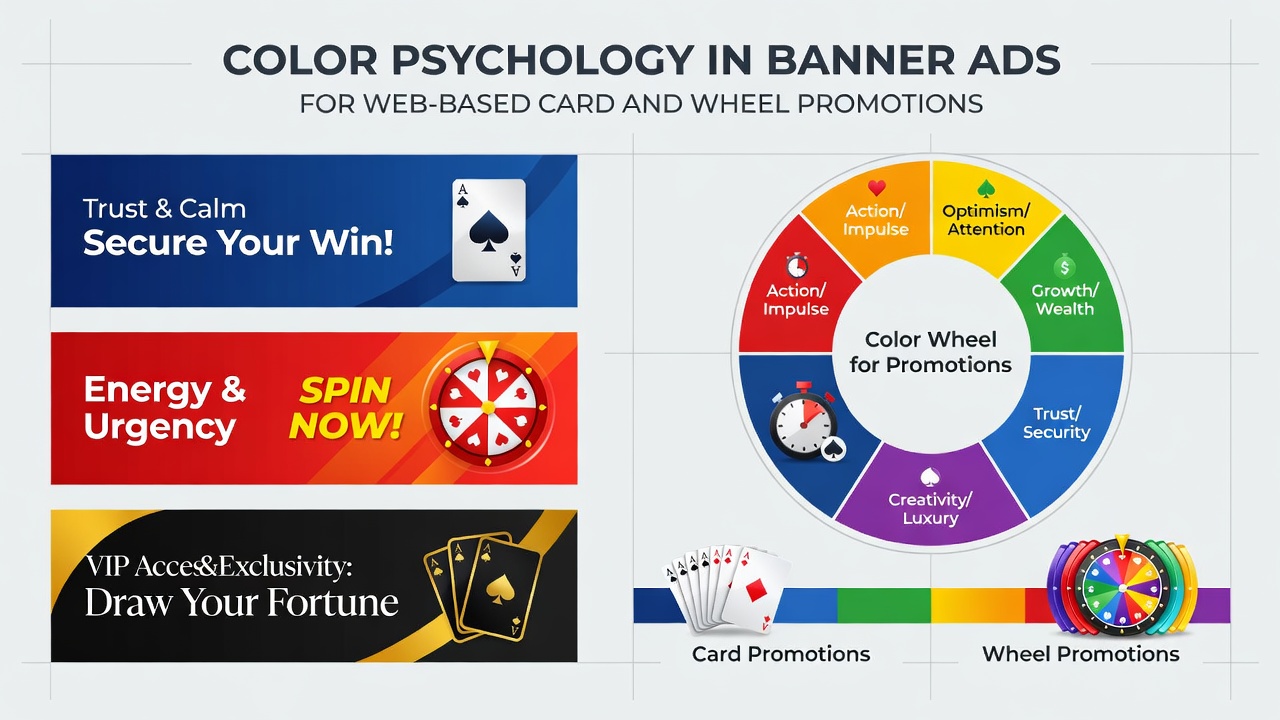
Color choices in digital advertising have long influenced how users interact with promotional content, and banner ads for web-based card and wheel promotions follow similar patterns according to research from various academic and industry sources. Observers note that specific hues trigger responses tied to excitement, trust, and decision-making, which matter when promoting games such as blackjack, roulette, and poker across online platforms. Data from marketing analyses show that red tones often appear in calls to action because they associate with urgency and energy, while blue shades appear more frequently when operators seek to convey reliability during user sign-up flows.
Core Principles Behind Color Selection
Studies on visual perception indicate that warm colors like red and orange increase heart rate and attention levels, whereas cool colors such as blue and green promote calm and prolonged viewing. Researchers at institutions across North America and Europe have documented these effects through controlled experiments involving digital interfaces, revealing that participants exposed to red-dominant banners clicked through at higher rates during short exposure times. In the context of card and wheel promotions, these reactions align with game themes where red and black dominate roulette wheels and playing card suits, creating visual continuity between the banner and the actual game environment.
Green frequently signals financial opportunity or safety, which explains its presence in banners highlighting deposit bonuses or progressive jackpots. Industry reports from organizations like the American Gaming Association note that operators adjust palettes seasonally, with brighter greens appearing in spring campaigns to suggest growth and renewal. Yellow accents draw the eye to limited-time offers without overwhelming the overall design, allowing text elements to remain legible across different screen sizes.
Application to Card Game Promotions
Banners promoting blackjack and poker often combine deep reds with metallic golds to evoke casino table aesthetics while maintaining contrast for readability. Data collected from affiliate networks indicate that red-and-black combinations produce stronger click-through performance in evening hours, when users tend to browse leisure activities. Designers adjust saturation levels to prevent visual fatigue, since prolonged exposure to highly saturated reds can reduce engagement over multiple page views.
Case examples from North American platforms demonstrate that shifting from pure red to burgundy tones in poker tournament banners increased average session duration by measurable margins. The change maintained urgency cues yet introduced a sense of sophistication that appealed to users seeking skill-based card experiences. Typography colors receive equal attention, with white or light gray lettering placed against darker backgrounds to ensure accessibility standards remain met across devices.
Wheel Game Considerations and Regional Patterns
Roulette and other wheel promotions rely heavily on the iconic red-and-black wheel segments, so banners frequently mirror these colors to create instant recognition. Australian regulatory bodies and research groups have published findings showing that green backgrounds paired with wheel imagery increase trust signals for users in that region, where wheel games hold particular popularity. Operators incorporate subtle gradients that transition from dark green to emerald to maintain visual interest without distracting from the central promotional message.
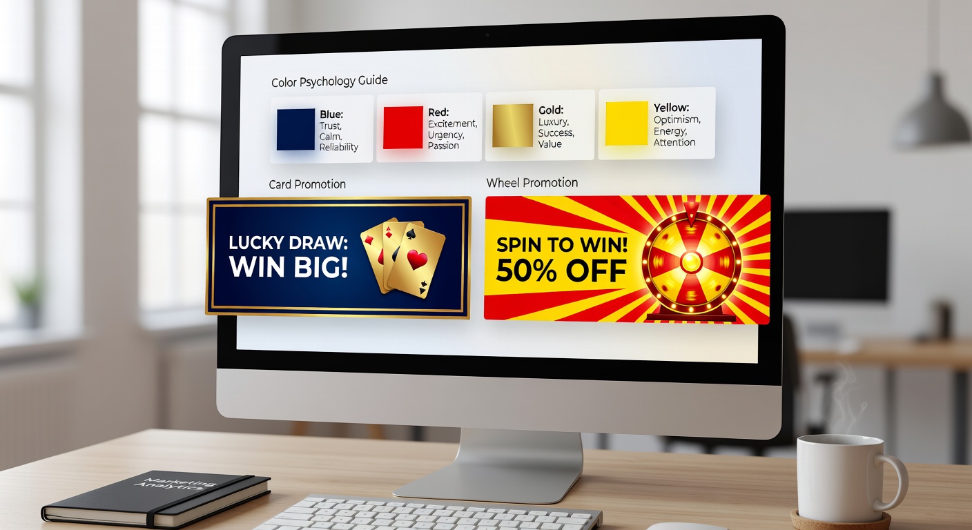
European platforms sometimes favor navy blue combined with gold for wheel promotions, reflecting preferences observed in market testing conducted during 2025. These combinations appear in banners targeting users who value structured gameplay and statistical elements, as blue tends to support longer consideration periods before clicks occur. Observers tracking performance metrics note that such palettes perform consistently across desktop and mobile formats when image compression preserves color accuracy.
Testing and Measurement Approaches
A/B testing remains standard practice for determining effective color combinations in banner campaigns. Platforms run parallel versions of the same promotion using different dominant hues, then compare conversion data over set intervals. Figures from Canadian research institutions reveal that green-to-blue shifts in deposit-focused banners improved completion rates for wheel game welcome offers during multi-week trials conducted in early 2026.
Heat mapping tools further reveal where user attention lands first on a banner, allowing designers to place key promotional text within high-attention zones defined by color contrast. June 2026 saw increased adoption of real-time color adjustment tools that respond to user location data, enabling operators to serve regionally preferred palettes without creating separate creative assets for each market.
Accessibility and Technical Factors
Color contrast ratios receive careful calibration to meet web accessibility guidelines, ensuring text remains readable for users with varying visual capabilities. Industry reports emphasize that insufficient contrast between background and foreground colors reduces click performance regardless of psychological associations. Developers therefore pair high-contrast text colors with psychologically effective backgrounds, maintaining both engagement potential and compliance requirements.
Load times also influence color effectiveness, since heavily compressed images can shift hues on certain displays. Technical teams test banner renders across browsers and devices to preserve intended psychological effects, particularly when gradients or metallic finishes appear in card and wheel themed designs.
Conclusion
Color psychology continues to shape how banner ads communicate value in web-based card and wheel promotions. Research from multiple regions demonstrates measurable differences in user response based on hue selection, while practical testing refines these applications for specific game types and audiences. Operators who align color choices with both game aesthetics and regional preferences achieve more consistent engagement outcomes across promotional campaigns.