The Design Foundations Driving Effective Gambling Site Promotional Banners
Blake Schwarz · Jul 19, 2026
The Design Foundations Driving Effective Gambling Site Promotional Banners
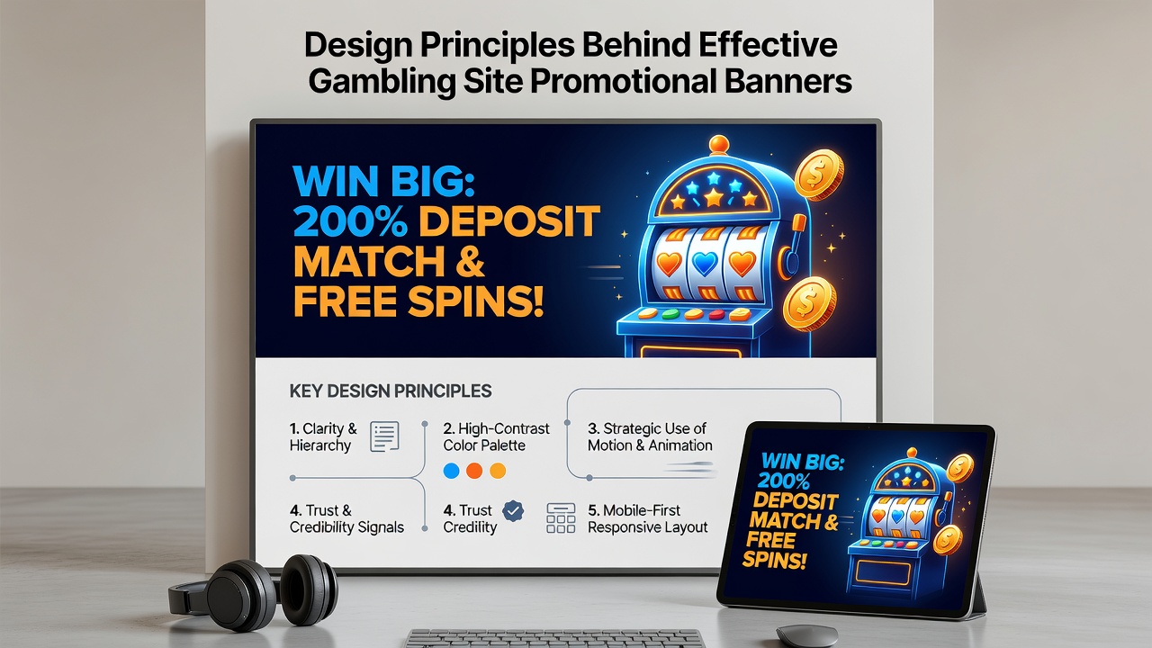
Design principles that shape promotional banners on gambling sites combine visual psychology with measurable user behavior patterns, and these elements work together to guide attention while maintaining compliance across regulated markets. Observers note that successful banners balance bold visuals with functional clarity, since platforms operating in July 2026 continue to refine these approaches based on ongoing analytics from desktop and mobile traffic sources.
Color Selection and Contrast Dynamics
Color choices in gambling banners draw from established principles of visual attention where high-contrast combinations such as deep reds paired with neutral backgrounds direct the eye toward key offers, and researchers tracking eye-movement data confirm that certain palettes increase dwell time by measurable margins. Industry reports indicate that warm tones often pair with accent highlights to create urgency without overwhelming the layout, whereas cooler schemes tend to support longer-term brand recognition in repeated exposures across multiple campaigns.
Typography and Message Hierarchy
Typography systems prioritize legibility at varying screen sizes, and this matters because banners appear in both wide desktop formats and narrow mobile feeds where users scan quickly. Experts have observed that bold sans-serif fonts for primary headlines combined with lighter weights for supporting details maintain readability, while excessive font variations can fragment attention and reduce click-through consistency across different audience segments.
Layout Structure and Visual Weight
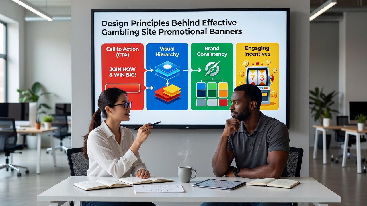
Effective layouts establish a clear visual path that leads from the main offer through supporting details and finally to the call-to-action button, and this progression relies on balanced spacing rather than crowded arrangements. Data shows that banners using the rule of thirds or similar compositional guides achieve higher engagement rates because they place critical elements at natural focal points, and developers often test these arrangements through heat-mapping tools to validate performance before wider deployment.
Call-to-Action Placement and Wording
Call-to-action buttons function best when positioned after the primary message yet remain prominent enough to stand out from surrounding graphics, and studies of user interaction reveal that concise phrases outperform longer sentences because they reduce cognitive load during rapid browsing sessions. Platforms adjust button size and color relative to the overall banner palette to ensure visibility while still meeting accessibility standards that various regulatory bodies enforce.
According to findings published by the American Gaming Association, banner performance metrics improved when operators applied consistent testing protocols across campaigns, and these protocols often incorporate A/B variations that isolate single variables such as button color or headline length. The approach allows teams to identify which combinations produce stronger results without relying on assumptions about audience preferences.
Mobile Responsiveness and Technical Adaptation
Banners designed for mobile environments must scale without losing legibility or distorting proportions, and this requirement becomes especially relevant as traffic data from 2026 shows continued growth in smartphone usage for gambling platforms. Developers incorporate flexible grid systems and vector-based graphics so that elements remain crisp on high-density screens, while touch-target sizing follows established guidelines to prevent accidental clicks that frustrate users and lower conversion figures.
Regulatory Alignment in Visual Elements
Design teams integrate compliance requirements directly into the creative process, ensuring that age-restriction notices, responsible gambling messaging, and regional licensing information appear without disrupting the visual flow. Reports from the European Gaming and Betting Association highlight how standardized placement of these elements across banners helps operators maintain consistency while still allowing creative flexibility within approved frameworks.
Testing Methods and Performance Tracking
Continuous testing cycles that combine quantitative metrics with qualitative feedback provide the data needed to refine banner designs over time, and teams often run multivariate experiments that examine interactions between color, copy, and imagery simultaneously. Observers note that platforms maintaining detailed records of these tests can identify seasonal patterns and adjust creative assets accordingly, particularly around major sporting events or holiday periods when user volumes shift.
Conclusion
Design principles behind effective gambling site promotional banners rest on the integration of color theory, typography, layout logic, and regulatory awareness, all validated through systematic testing. As platforms evolve through 2026 and beyond, the focus remains on measurable outcomes that connect visual decisions with user behavior data across diverse markets and devices.